Graphs of Model 1B after 1000 iterations…
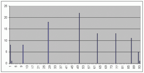
Well, Excel is installed now and after running Model 1B for 1000 iterations, I’ve done some preliminary graphs… the first is income distribution…
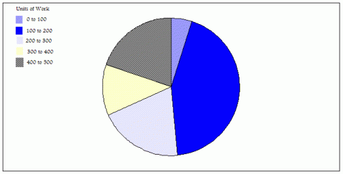
I think this compares quite favorably with captialism… the second graph is units of work…
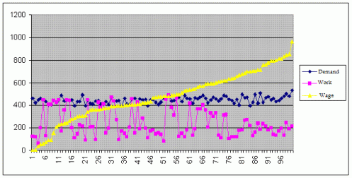
This one is not so good… at least with regards to ensuring no shortages… almost 50% work 100 to 200 units… however it is not all bad news… the percentages do not tend to zero as the number of units increase with the second biggest share being the maximum 400 to 500 units of work… the final graph is an attempt to see what is happening with demand plotted against work and income… This is the graph that suggests something is wrong with my model… or rather that it exhibits unrealistic behavior since it seems to show a slight trend, at least towards the end, that the less you work the more you earn… given that actors in wikibudgeting will have access to such information it seems unlikely that such a trend would be tolerated… the other correlation that seems evident is that smaller demand corresponds to smaller work…
Well anyway, besides trying to improve the model, I still have not established whether the model actually tends towards a static picture or a dynamic one, both between the agents and as a whole… that is the next thing to do…

